
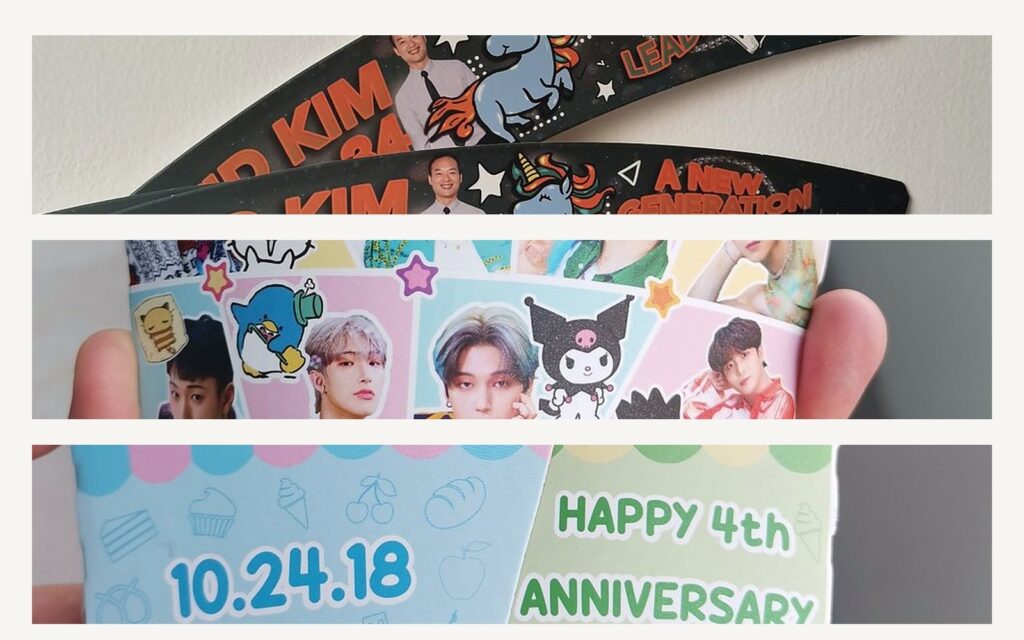
What the sleeve is doing for you
Heat and condensation. A double-wall cup reduces the burn but not the condensation. The sleeve absorbs what runs down the outside and keeps the hand dry — on a corrugated sleeve that is the flute, on a flat sleeve it is the absorbency of the stock.
Grip. A coated cup in a wet hand is a slip hazard. Uncoated or textured stock gives friction that a glossy cup never will.
Time in hand. This is the one buyers underestimate. A business card goes into a pocket and is never looked at again. A sleeve is held for the ten minutes it takes to drink the coffee, in front of everyone the customer walks past. Per unit, almost nothing else you can print gets that much attention.
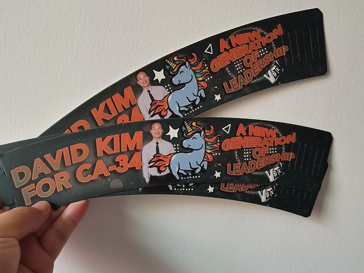
” alt=”Pair of black custom printed cup sleeves with gold campaign artwork, held against a wall to show the full wrap print and the fluted edge” width=”1200″ height=”900″/>
Paper stock: what each one does
Kraft, 250–300 gsm. The default for a reason: cheap, strong, and it reads as unbleached and natural. The catch is colour. Kraft is a brown-grey base, so any pale ink printed on it shifts warm and dark. A one-colour logo looks great. A four-colour photograph looks muddy. If you need white on kraft, it has to be laid down as an opaque base first, which is a second pass and adds cost.
White card, 250–350 gsm. The neutral option. Full-colour artwork reproduces close to what you approved on screen, and pastels stay pastel. Most cafe sleeves with illustrated or photographic artwork are on white card for this reason.
Corrugated (E-flute). The best insulation of the three, because the air channel in the flute is doing the work rather than the paper. It is also the bulkiest: a carton holds far fewer sleeves, so freight per unit climbs faster than the print price does. Worth it for hot drinks served outdoors, less so for a 12oz latte drunk indoors.
Coatings. Aqueous varnish or lamination makes the sleeve resist spills, and on an event sleeve that matters. It also makes the sleeve non-recyclable in most municipal streams and slightly slippery in the hand. If your brand talks about sustainability, uncoated is the consistent choice.
Getting the fit right

” alt=”Diagram showing how to measure a cup for a custom printed sleeve: top diameter across the rim, bottom diameter across the base, and height along the side” width=”1200″ height=”900″/>
Measure the cup you will actually use. Three numbers are enough: top diameter across the outside of the rim, bottom diameter across the base, and the height from rim to base along the side. Send those and the die line can be drawn to your cup rather than to a generic one.
The taper is the whole game. A sleeve is a truncated cone, not a cylinder. If the taper angle is wrong the sleeve will grip at the top and stand off at the bottom, or fold in half when pushed on. This is why we cut a die rather than print a flat rectangle and hope.
Allow for the overlap. The sleeve wraps around and glues to itself, so the flat blank is longer than the circumference. Roughly 10mm of overlap is normal; more if the stock is thick. You do not need to calculate this — it is our job — but it explains why the printed artwork needs a bleed on one end and not the other.
Deeper is not always better. A sleeve that covers two-thirds of the cup insulates well and still leaves the cup’s own branding visible. A full-wrap sleeve hides the cup and gets noticeably hotter to hold because there is more surface in contact with the hand.
Print: what survives a hot, wet object
Solvent and water-based inks on uncoated stock sit in the fibre. They look softer, they scuff less than people expect, and they do not crack when the sleeve flexes as it is pushed on. This is the normal choice for kraft.
UV inks sit on top and give a sharper, brighter result on coated or white card. They are more resistant to rubbing, but a heavy UV solid on a coated sheet feels plasticky in the hand, which undercuts the point of a paper sleeve.
Large dark solids are the risk area. A full-bleed black sleeve with no coating will mark where wet hands grip it, and the marks show. Either coat it, or design the dark area so it does not sit exactly where a thumb lands.
White ink on kraft or on coloured stock is a separate pass. It is worth it for a logo that has to be pure white, and not worth it for anything else.
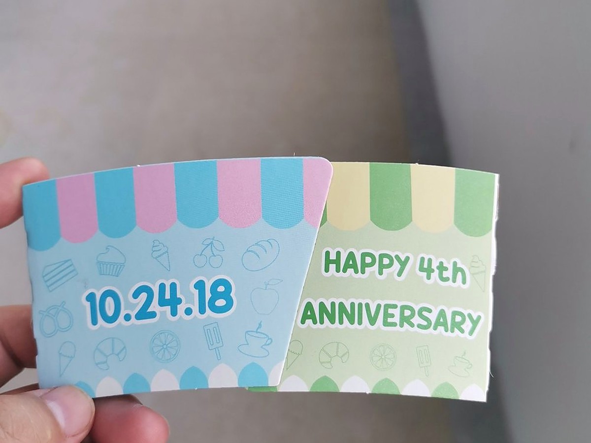
” alt=”Two pastel custom printed cup sleeves side by side, one printed with the date 10.24.18 and one reading Happy 4th Anniversary, showing pale ink coverage on white card” width=”1200″ height=”900″/>
Quantities, minimums and lead time
Sleeves are one of the few printed items where a small run makes sense, because the die is short-lived and the set-up is quick. We run low minimums on flat sleeves — a few hundred pieces is a realistic order for a single cafe, not a factory-scale one.
The cost curve is steep at the start and almost flat after that. Doubling from 500 to 1,000 usually adds far less than double the price, because the plate and die are already paid for. If you are close to a round number, ask for both tiers and look at the curve rather than the headline price.
Lead time depends on whether a new die is needed. With an existing die line and artwork approved, production is days, not weeks. A new shape or a first order adds die cutting to the front of the schedule — so if a date matters, start with the cup in hand rather than with the artwork.
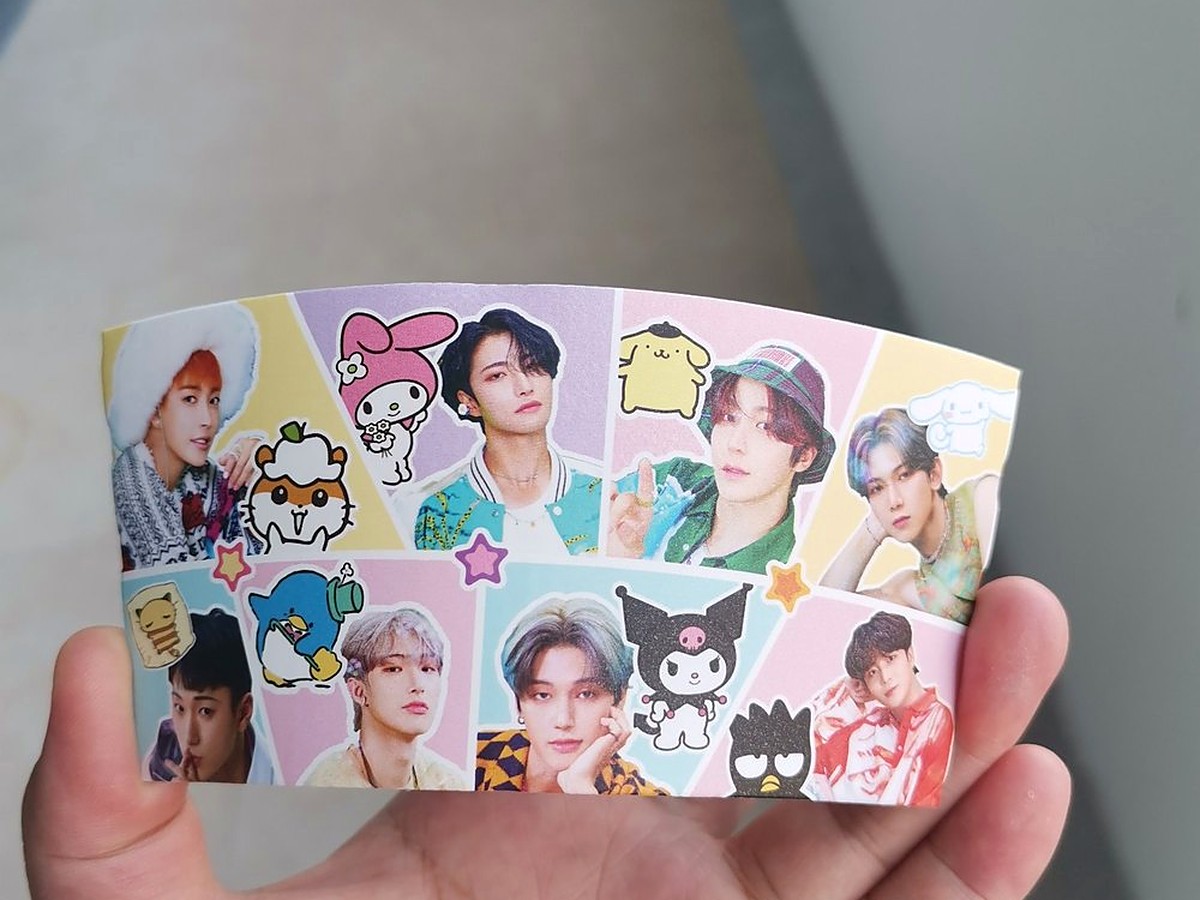
” alt=”Custom printed cup sleeve covered in sticker-style portrait artwork, held to show the printed wrap and the paper thickness at the edge” width=”1200″ height=”900″/>
Five mistakes worth avoiding
1. Quoting from the cup size instead of the cup. Covered above, and still the most common.
2. Designing across the glue seam. The seam is where the sleeve closes. Text that crosses it will be split, and on a dark sleeve the seam shows as a light line.
3. Four-colour artwork on kraft. It will not look like the proof. If the design depends on accurate colour, move to white card.
4. Forgetting the inside. On a sleeve that is printed both sides, the inside is visible every time a customer turns it over — which is often, because that is where the recycle mark normally sits.
5. Ordering sleeves and coasters separately. If you are printing both, print them together: one proof, one colour match, one shipment. There is a separate guide on why coasters and sleeves work best as a set.